"Mammon" Graphic Novel Review
Written by James Ferguson
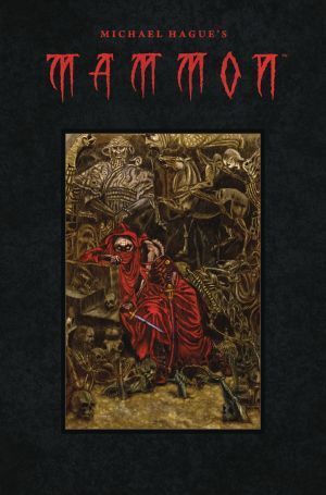
Published by Dark Horse Comics
Lettered by Nate Piekos
2018, 136 Pages, $19.99
Comic released on August 22nd, 2018
Review:
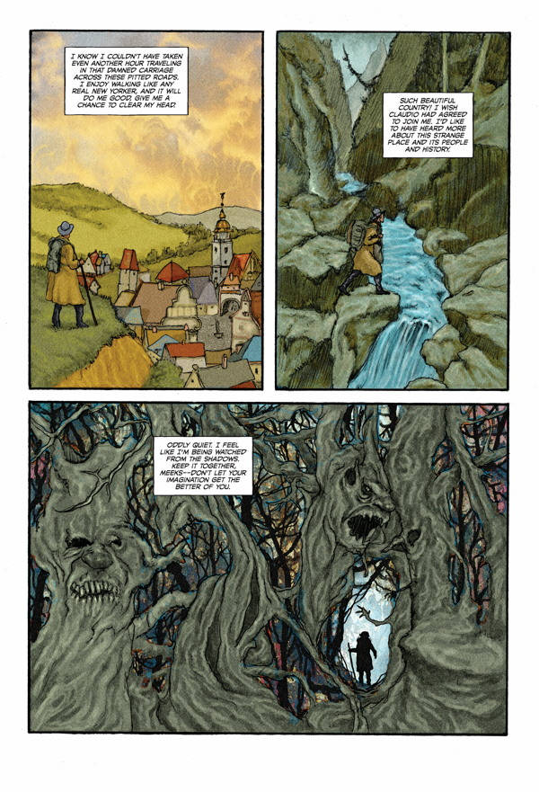
Jonathan Meeks wants more from life. He's bounced around a bit and settled as a writer for a newspaper in New York, but he longs to write the Great American Novel. When his review of a stage performance of Dracula catches the eye of a mysterious and powerful man, Jonathan's life is changed forever. He learns vampires are very real and he's about to get caught up in their centuries long war.
Mammon is an unpredictable story. If Jonathan's journey sounds familiar, it could be because this book started as an adaptation of Bram Stoker's Dracula before writer / artist Michael Hague grew and evolved it into something unique. Just when you think you know where the book is going to go, it takes a harsh turn into very new territory, presenting an epic saga of good vs evil...or rather, evil vs a different kind of evil.
   |
| Click images to enlarge |
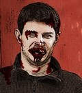
The character, Mammon is unsettling from the first moment he appears. He's clad in these long red robes that extend up to cover the lower half of his face. The small parts of his body that are exposed – his hands, eyes, and ears, are somewhat deformed, looking more like the skin of a reptile than that of a man. The first instinct is to say he's obviously a vampire and he's going to kill Jonathan, right? Nope! That's where the twist comes in.
I won't spoil the ins and outs of the story, as it really it something entirely unique. Hague delves deep into the folklore surrounding vampires and their origins, creating something dark and intriguing. Everything is meticulously planned out, which is a good thing and a bad thing. It's great because you get such a rich background of this mythos, but it can be a little text heavy at times, coming through almost like a history lesson.
Mammon is far from the only monster we meet. There are some absolutely terrifying creatures on display, including warrior monkeys and Satan himself. The designs get more gruesome and disturbing with each new one that's revealed. Satan is particularly monstrous, appearing as a giant brute with a distorted jaw that extends up to where his nose should be. I don't know how he would open his mouth or eat, but I'm sure it would be frightening to see.
   |
| Click images to enlarge |
Speaking of Satan, he's the only one that gets a different style of word balloon from letterer Nate Piekos. It does make sense, as he's the devil, so he should have something to differentiate himself, however, I would have liked if some of the other monsters had some variation in their speech since they're supernatural beings.
Hague's style plays up the gothic aspects of these beings in a more old-school approach that works well with the tone of the story. It's set in the 1920s and that definitely comes through in the look and feel of Mammon. The artwork can appear a little flat at times, but that doesn't distract from the story as a whole. The visuals are unlike anything on the comic stands today.
Mammon has its foundation in Bram Stoker's Dracula, however Michael Hague builds something new and bigger on top of it. It's a sprawling supernatural epic touching upon monsters of all shapes and sizes, forcing you to question the nature of evil itself.
Grades: |
||||||
| Story: |  |
  |
 |
 |
 |
|
| Art: | |
|||||
| Overall: | ||||||
This page includes affiliate links where Horror DNA may receive a small commission at no extra cost to you.